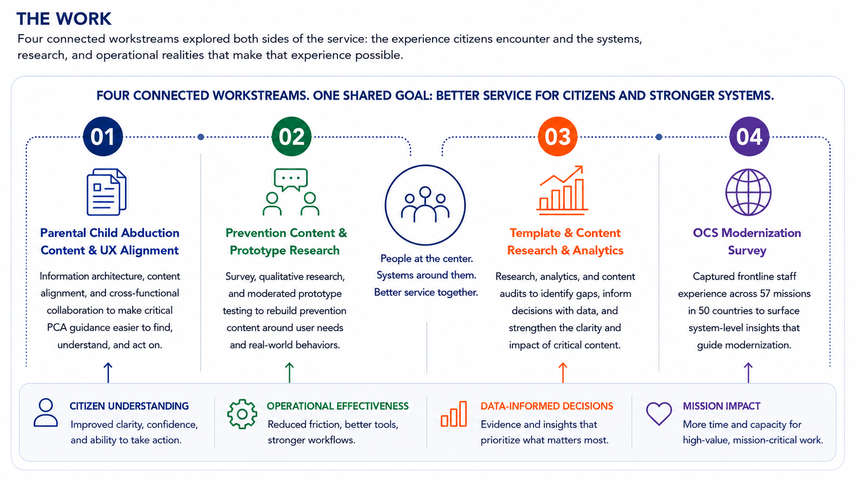
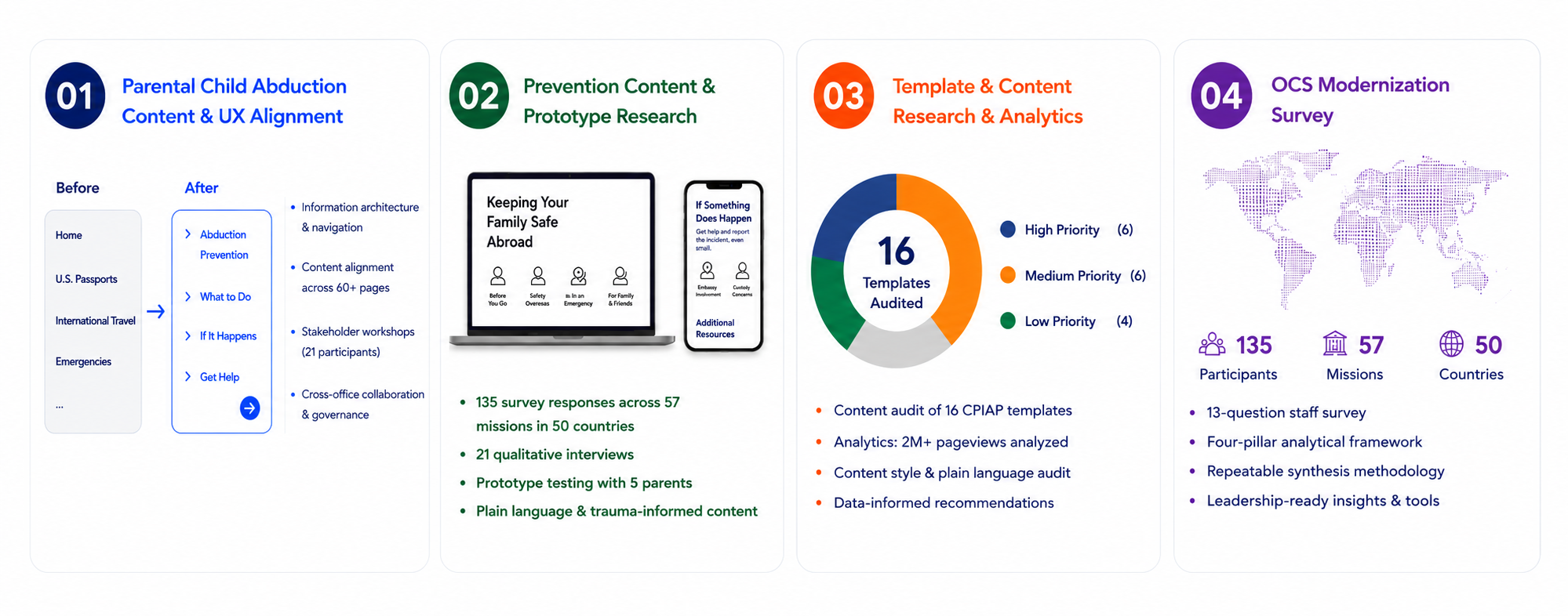
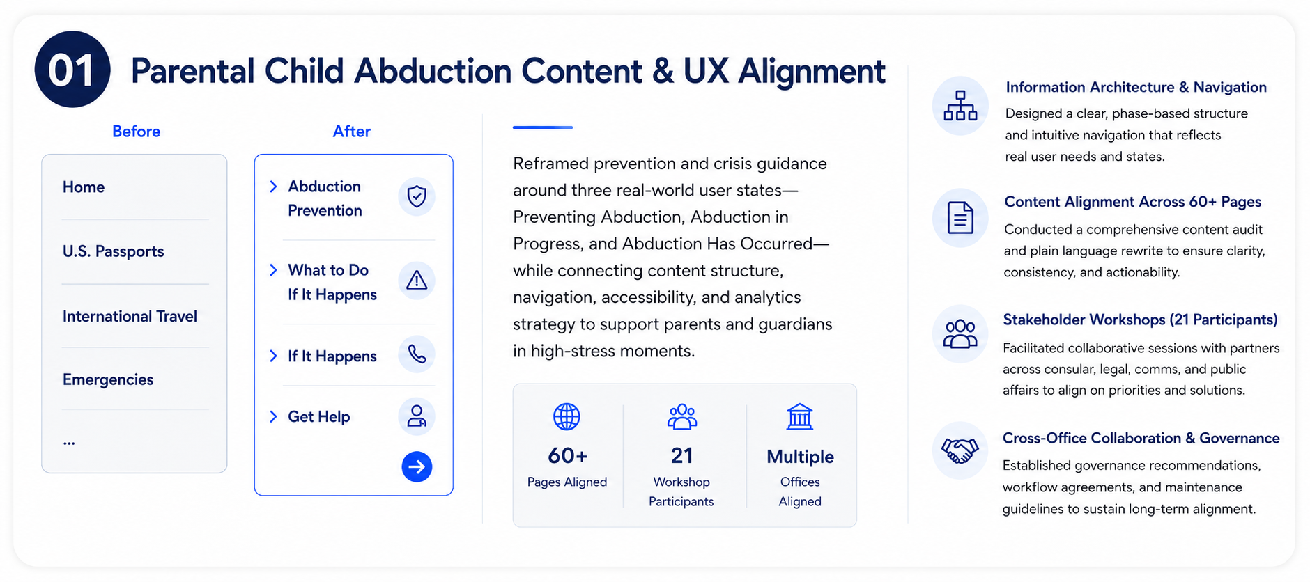
Reframed prevention and crisis guidance around three real-world user states—Preventing Abduction, Abduction in Progress, and Abduction Has Occurred—while connecting content structure, navigation, accessibility, and analytics strategy.
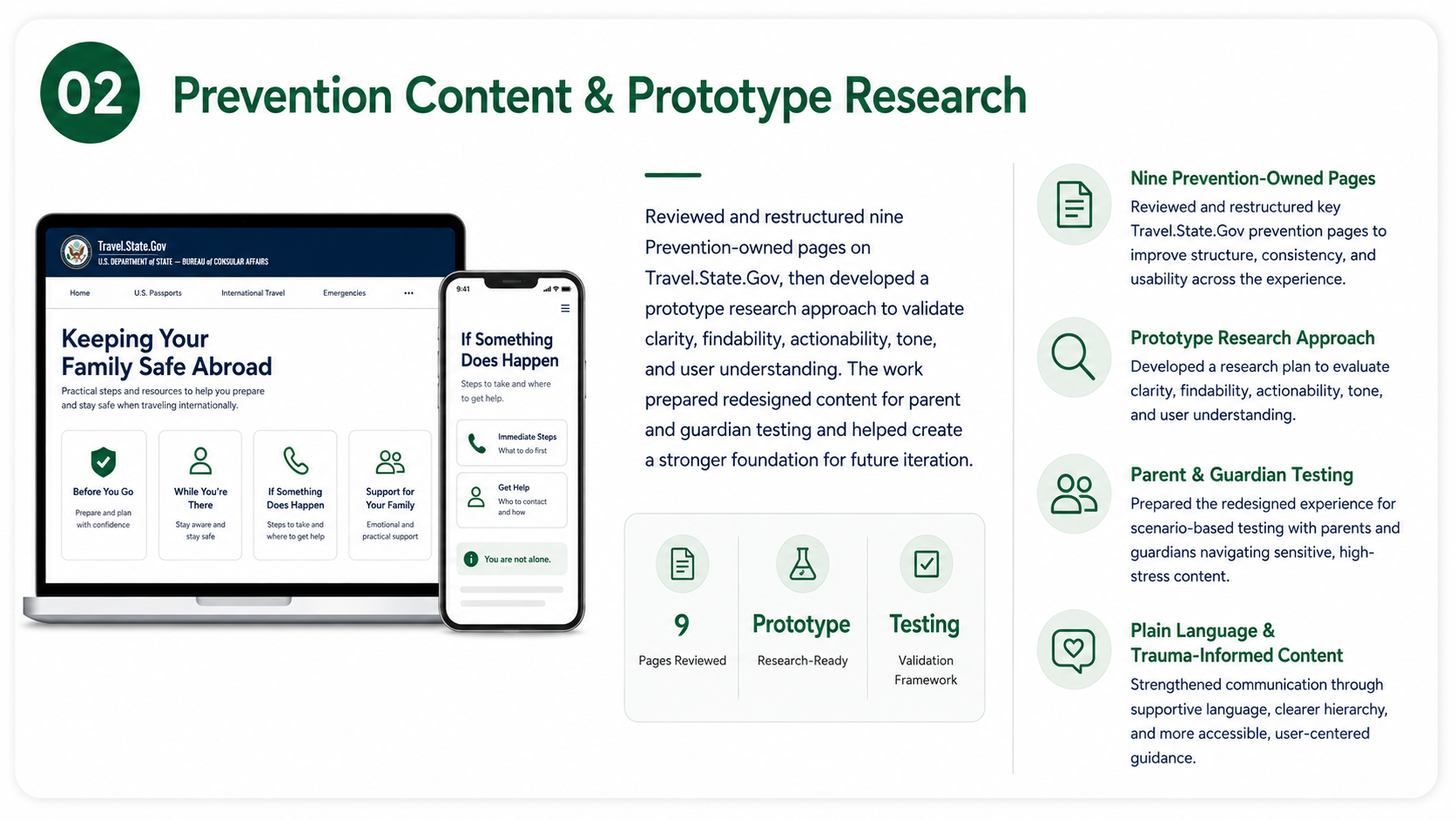
Reviewed and restructured nine Prevention-owned pages on Travel.State.Gov, then developed a prototype research approach to validate clarity, findability, actionability, tone, and user understanding.
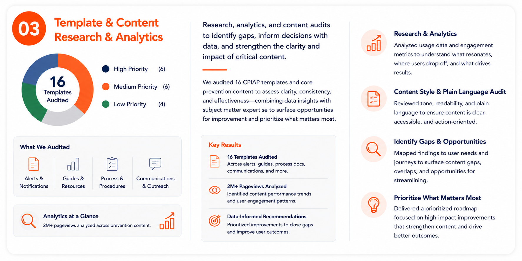
Audited and prioritized 16 CPIAP templates, combining content and plain-language review with analytics across 2M+ pageviews to identify gaps, understand behavioral patterns, and develop data-informed recommendations.
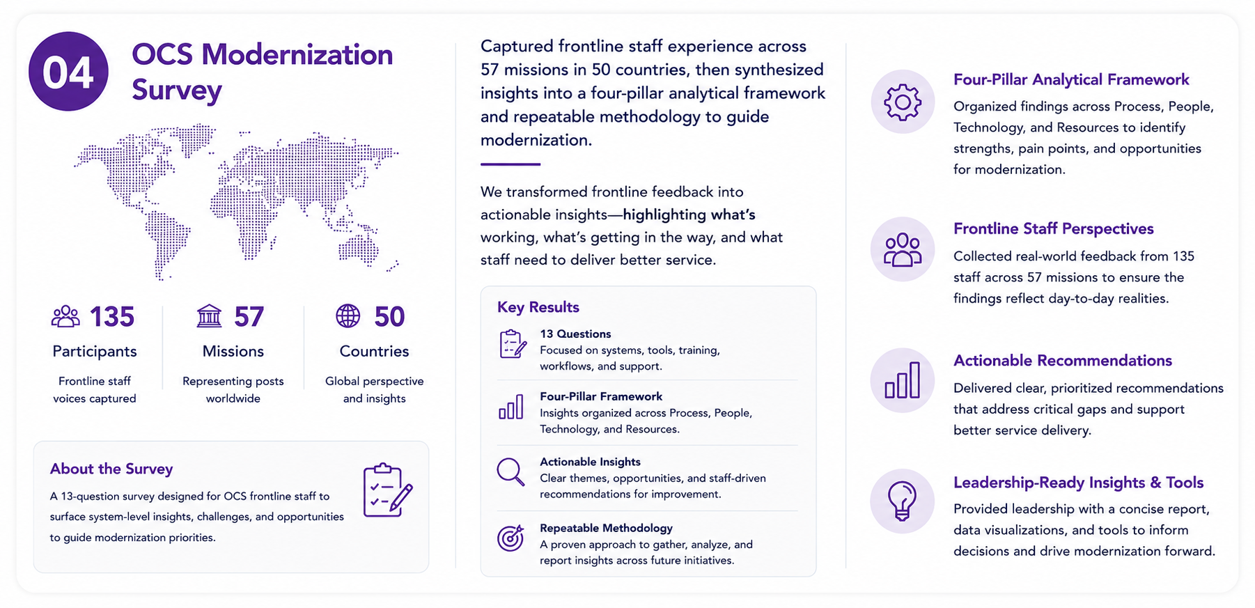
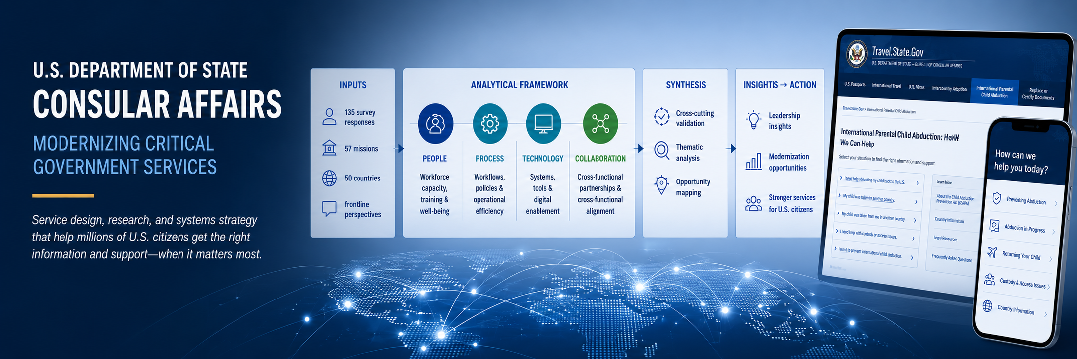
Synthesized 135 staff responses across 57 missions in 50 countries into a four-pillar analytical framework and repeatable synthesis methodology that translated frontline operational experience into leadership-ready modernization insights.
Reframing a high-stress government experience around the situation families were actually in.
The Parental Child Abduction experience needed to support people navigating emotionally sensitive and time-critical situations. The existing content structure made it difficult for users to quickly determine which guidance applied to them, what action they should take next, and how urgent their situation was.
I supported an initial UX-focused content review aimed at better aligning the experience with real user needs rather than internal program structure. The work combined qualitative review, content analysis, information architecture, analytics planning, and cross-team collaboration.
The key shift
One of the most important changes was reorganizing the experience into three clear user-centered phases:
Preventing Abduction
Abduction in Progress
Abduction Has Occurred
This gave the experience a structure based on the user’s real-world situation and immediate intent. It also created a more empathetic and actionable foundation for future content revisions and navigation decisions.
Designing for movement, not a linear process
The work explored a phase-based navigation model, but we deliberately avoided treating the experience as a traditional step-by-step journey.
A family’s situation can change quickly, and users may need information from more than one phase. An overly linear progress indicator risked implying that people had to move through the content in a prescribed order.
Instead, I helped develop recommendations for flexible, non-linear navigation that allowed people to move between phases according to their immediate needs.
The UX concepts also included mobile-friendly and accessible layouts, clearer entry points for urgent situations, and progressive disclosure to reduce cognitive overload.
Turning the framework into page structure
The phase model was translated into a more detailed content structure.
For each phase, the work considered:
recommended sections and hierarchy;
CTA placement;
resource prioritization;
analytics touchpoints;
emotional context;
and accessibility considerations.
The goal was to improve findability, scannability, and actionability while giving users clearer signals about what to do next.
Connecting UX research with analytics
The qualitative review also raised an important question:
How would we know whether the new structure was actually helping people?
I worked to connect the UX findings with an analytics strategy that could provide behavioral evidence alongside the qualitative research.
The proposed measurement approach included event tagging by phase, scroll-depth tracking, funnel and path analysis, site-search review, and mobile-versus-desktop comparisons.
These signals could help the team understand whether users were engaging with the right content, where they were dropping off, which calls to action were being used, and where navigation patterns suggested unmet needs or confusion.
Bringing research and analytics together
I also helped prepare the framework for collaboration with the analytics team.
The intent was to connect early UX findings with behavioral data, define analytics and tagging needs, identify opportunities for future reporting or dashboards, and establish a clearer way to measure success across the user journey.
This moved the project from simply recommending a better content structure toward establishing a way to evaluate and continually improve it.
What I contributed
UX & content review — Evaluated the existing experience and helped identify how the information could better reflect user intent and urgency.
User-state framework — Helped structure the experience around Preventing Abduction, Abduction in Progress, and Abduction Has Occurred.
Information architecture & navigation — Explored phase-based, non-linear navigation and clearer entry points for users in urgent situations.
Page structure — Developed recommendations for hierarchy, CTAs, resources, progressive disclosure, accessibility, and emotional context.
Analytics strategy — Connected qualitative findings with proposed GA4 measurement approaches including event tagging, paths, search behavior, and engagement.
Cross-functional alignment — Helped establish the basis for collaboration between UX and analytics around measurement and future refinement.
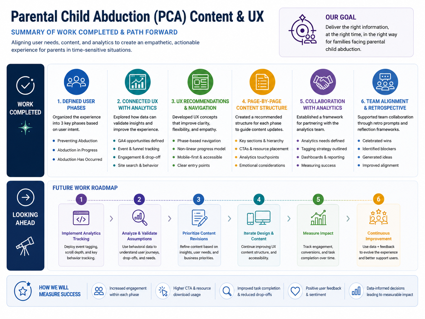
Content and UX alignment summary showing completed work, future roadmap, and proposed measures of success.
Where the work was headed
At the close of this workstream, the project was moving from:
initial qualitative content review → analytics alignment → measurable content refinement
The identified next steps were to implement analytics recommendations, validate assumptions with behavioral data, prioritize content revisions, and continue iterating on the UX and content using both qualitative and quantitative evidence.
Why this work matters
In a crisis-oriented service, information architecture is not simply an organizational problem.
It affects whether someone can quickly understand:
Where am I in this situation?
What information applies to me?
What can I do now?
Where do I go next?
By organizing the experience around user state rather than institutional structure, the work created a stronger foundation for guidance that could be clearer, more flexible, and more responsive to the realities families were navigating.

Turning redesigned prevention guidance into a research-ready experience that could be tested with parents and guardians.
Following the initial content and UX alignment work, the next challenge was to prepare the redesigned Prevention experience for validation with parents and guardians.
The work focused on public-facing Prevention content for people at different stages of international parental child abduction risk—including prevention, an abduction in progress, and an abduction that had already occurred.
Rather than treating each page as an isolated content problem, I helped document the revised experience across nine Prevention-owned pages and develop the research structure needed to understand whether people could actually find, interpret, and act on the new guidance.
Reviewing the experience across nine connected pages
The content audit looked beyond basic readability. Each page was evaluated against several dimensions of the experience:
purpose and intended audience;
readability and plain language;
actionability and scannability;
navigation and findability;
tone and emotional appropriateness;
content hierarchy and redundancy;
visual and media effectiveness;
and the clarity of legally complex information.
The resulting recommendations emphasized clearer audience framing, a consistent and supportive tone, stronger content hierarchy, more explicit actions and timelines, better cross-linking between related resources, simplified legal explanations, and stronger integration of FAQs and supporting resources.
Creating a shared picture of the revised content
I helped summarize the intended purpose, audience, and key structural changes for nine Prevention-owned pages:
Preventing International Child Abduction
How to Prevent an Abduction Before It Happens
How the U.S. State Department Can Help
Children’s Passport Issuance Alert Program (CPIAP)
Working with Local Law Enforcement
Stopping an Abduction in Progress
The Sean and David Goldman International Child Abduction Prevention and Return Act
Child Abduction FAQ
Resources for Parents
Documenting the pages this way created a clearer connection between individual content decisions and the larger experience parents and guardians would move through.
Moving from redesign to validation
Once the revised content structure was documented, I helped develop the research framework for the next round of prototype testing.
The study was organized around three parts:
1. Warm-Up & Contextual Questions
Understand participants’ mental models, previous experiences with Travel.State.Gov, and expectations of government prevention information and support.
2. Think-Aloud Prototype Walkthrough
Observe how participants navigated and interpreted the redesigned experience while completing realistic tasks.
3. Wrap-Up Reflection
Capture broader reactions to clarity, usefulness, trust, tone, and the overall experience.
Testing the experience through real-world tasks
Rather than asking participants whether they “liked” a page, the research plan centered on scenarios and tasks that reflected decisions parents might actually need to make.
Tasks included finding information about:
enrolling a child in CPIAP;
dual nationality;
local resources;
the Hague Convention;
the limits of State Department assistance;
and emergency guidance during an abduction scenario.
Each task was paired with page-specific validation questions, think-aloud guidance, and follow-up probes so that the research could examine not only whether someone reached the right information, but how they understood it along the way.
Designing observation into the research
I also helped create a structured observation framework for notetakers.
Researchers were prompted to capture:
navigation behavior;
content comprehension;
emotional reactions;
hesitation or confusion;
trust and tone feedback;
use of alerts, cross-links, and page hierarchy;
and whether participants understood what to do next.
Particular attention was given to elements that had changed in the redesign—including alert visibility, audience-oriented headings, scannability, legal clarity, and the emotional appropriateness of information presented during crisis-oriented tasks.
Connecting design decisions to research questions
An important part of this work was making sure the prototype study did not operate separately from the redesign.
The validation questions and observations were tied directly to specific content and information-architecture decisions.
That meant the eventual research could answer more useful questions than simply:
“Can someone use this page?”
It could examine:
Did the revised hierarchy help?
Did users notice the alert?
Did audience framing improve orientation?
Was the legal information understandable?
Could participants identify a next step?
Did the tone support rather than intensify an already stressful situation?
This created a clearer line from design decision → research question → observation → future iteration.
What I contributed
Content audit documentation
Captured the purpose, intended audiences, and major content and structural changes across the nine-page Prevention experience.
Research framework
Developed the overall structure for contextual inquiry, think-aloud prototype testing, and wrap-up reflection.
Scenario-based tasks
Created realistic tasks covering CPIAP, dual nationality, legal resources, State Department limitations, and crisis guidance.
Validation questions & probes
Connected research questions directly to revised content and IA decisions.
Observation framework
Created notetaker guidance for capturing navigation, comprehension, trust, emotional response, hesitation, and next-step understanding.
Research guide integration
Brought moderator instructions, privacy and consent procedures, research tasks, page-level questions, observation guidance, and closing procedures into a unified Parent/Guardian User Research Interview Guide.

Prevention content and prototype research summary showing completed work, the planned validation path, ongoing measurement, and guiding principles.
What this work produced
The work resulted in a research package that included the page-by-page redesign documentation, structured interview framework, scenario-based usability tasks, validation question bank, notetaker observation prompts, and an integrated moderator/notetaker research guide.
Importantly, this represented preparation for the next round of usability testing and validation. The work established how the redesigned experience should be tested; it should not be presented in the portfolio as though that validation had already occurred.
Why this work matters
Redesigning critical information is only part of the job.
In a service involving child safety, legal complexity, and potentially urgent family situations, a design team needs evidence that people can understand the guidance under the conditions in which they may actually need it.
This work created the bridge between content redesign and evidence: a structured way to test whether clearer language, stronger hierarchy, better navigation, and more supportive communication actually helped parents understand what was happening and what to do next.
Designing a trauma-informed research approach for emotionally sensitive testing
Once the revised Prevention experience was ready for validation, the next challenge was how to conduct usability research responsibly with parents and guardians discussing international child abduction.
This could not be treated like a conventional website usability study. Participants might be asked to imagine stressful family situations, interpret complex legal and government information, and respond to scenarios involving an abduction in progress.
I helped develop a structured, trauma-informed research framework that balanced the need for rigorous usability evidence with consent, emotional awareness, clarity, and participant control.
Starting with two separate research tools
The work began with two separate documents:
an existing moderator guide;
a set of interview and research questions.
I consolidated these into a single Parent/Guardian Moderator Guide with a consistent session flow, researcher roles, consent procedures, technical setup, research tasks, observation guidance, and closing procedures.
Bringing the materials together reduced duplication and helped ensure that different researchers could conduct sessions more consistently.
Building the research around the participant
The study was structured into three major stages:
1. Warm-Up & Contextual Questions
Establish participants’ mental models, prior experiences, expectations, and familiarity with Travel.State.Gov before introducing the prototype.
2. Think-Aloud Prototype Walkthrough
Use realistic scenarios and tasks while asking participants to verbalize what they notice, expect, understand, and decide.
3. Wrap-Up & Reflection
Capture broader feedback about clarity, trust, tone, usefulness, emotional response, and the overall experience.
This sequence allowed the research to understand not just whether someone could complete a task, but how they interpreted the service along the way.
Connecting the research directly to the redesign
The prototype walkthrough was developed page by page and tied directly to the design and content decisions being evaluated.
For each major page or topic, the guide included:
the relevant redesign changes;
a scenario-based task;
validation questions;
follow-up probes;
and specific behaviors for researchers to observe.
The walkthrough covered the redesigned Prevention experience, including content related to preventing international child abduction, State Department assistance, CPIAP, local law enforcement, stopping an abduction in progress, legal information, FAQs, and parent resources.
Going beyond task completion
Because this was sensitive content, success could not be measured simply by whether someone clicked the correct link.
The research framework prompted researchers to observe:
Navigation
Where did participants go first? Did the organization of the experience match their expectations?
Comprehension
Did participants understand the information and terminology being presented?
Hesitation and confusion
Where did people stop, reread, backtrack, or question what they should do?
Trust and tone
Did the content feel credible, supportive, and appropriate to the situation?
Emotional response
Did particular wording, scenarios, or content increase distress or create unnecessary uncertainty?
Next-step understanding
Could participants explain what they would do after reading the guidance?
This allowed usability, content comprehension, and emotional experience to be examined together rather than as separate concerns.
Making trauma-informed practice operational
Trauma-informed research was treated as part of the study design rather than simply a tone-of-voice principle.
The guide incorporated:
explicit consent procedures;
recording disclosure;
trigger warnings before sensitive scenarios;
emotional check-in moments;
supportive moderator language;
clear participant expectations;
and the ability to navigate sensitive material without unnecessary pressure.
The goal was not to remove difficult subject matter from the research. It was to make sure participants understood what they were being asked to engage with and retained appropriate control throughout the session.
Adapting the study for UserTesting
The framework was also adapted from a traditional Zoom-based study into a format compatible with UserTesting Live Conversations.
That required revising:
moderator instructions;
recording and verbal-consent language;
participant onboarding;
think-aloud guidance;
researcher and notetaker roles;
and the overall session flow.
The result was a research protocol that could be used consistently within the platform while preserving the ethical and trauma-informed requirements of the study.
What I contributed
Moderator guide integration
Combined separate research materials into one cohesive Parent/Guardian Moderator Guide.
Research structure
Developed the warm-up, think-aloud walkthrough, and wrap-up framework.
Scenario-based testing
Connected realistic parent/guardian scenarios to specific prototype tasks.
Page-level validation
Created questions and probes tied directly to revised content and information-architecture decisions.
Observation framework
Defined what researchers should capture across navigation, comprehension, trust, emotional response, hesitation, and next-step understanding.
Trauma-informed research practices
Integrated consent, trigger warnings, emotional check-ins, supportive language, and participant-centered safeguards.
Platform adaptation
Reworked the protocol for moderated research through UserTesting Live Conversations.
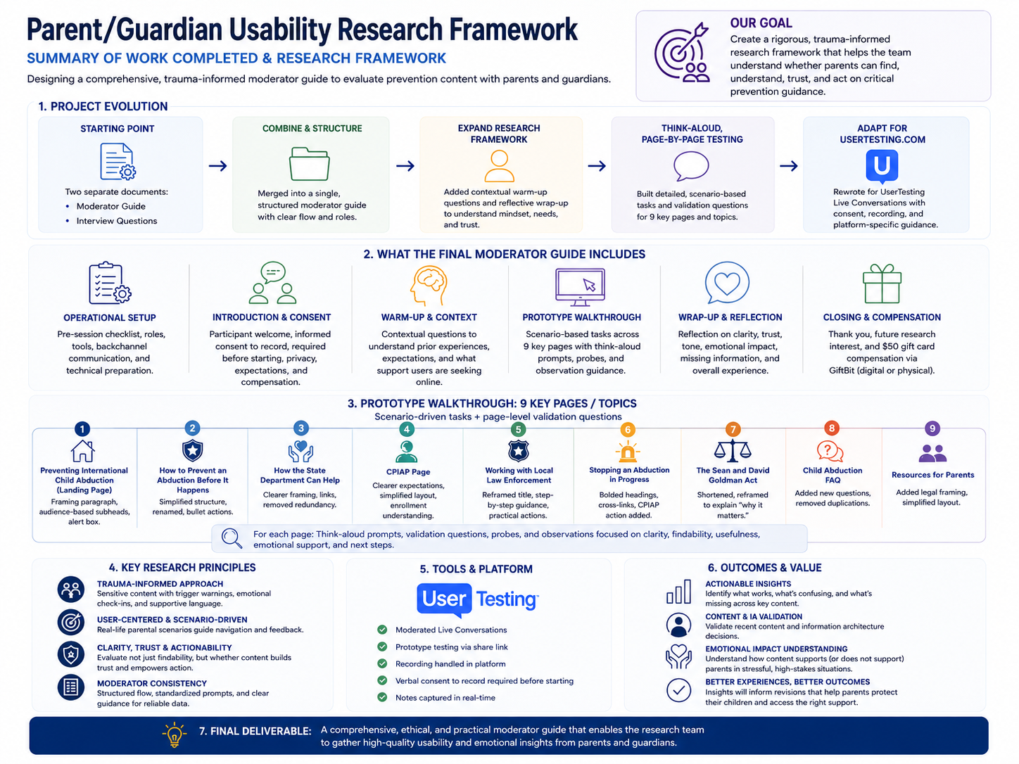
Trauma-informed parent/guardian usability research framework showing the evolution of the moderator guide, nine-page prototype walkthrough, research principles, platform requirements, and final deliverable.
What this work produced
The completed work resulted in a comprehensive moderated usability-testing framework containing:
moderator instructions;
consent and privacy procedures;
contextual interview questions;
scenario-based prototype tasks;
page-specific validation questions;
researcher probes;
notetaker observation guidance;
wrap-up questions;
and UserTesting-specific session procedures.
The framework established a consistent way for the research team to gather usability, comprehension, trust, and emotional-response evidence from parents and guardians.
Why this work matters
Research methods shape the evidence they produce.
When people are interacting with information about child safety, family crisis, and possible abduction, the research environment itself becomes part of the experience.
A rigorous study therefore needed to answer two questions at the same time:
Can people successfully understand and use the redesigned service?
and
Can we learn that without creating unnecessary distress or taking control away from the participant?
This framework was designed to do both.
Translating frontline staff experience into system-level modernization insight that leadership could act on.
The final workstream shifted from the public-facing experience to the system behind it.
OCS services are delivered through a distributed global network, and staff experience the consequences of policy, systems, approvals, tools, staffing, and local operating conditions every day. The modernization survey was designed to capture those realities without turning the exercise into a performance review or staffing justification.
I helped develop the research framing, synthesis methodology, analytical structure, and leadership narrative needed to turn frontline feedback into actionable system-level insight.
Framing the survey around systems, not blame
A foundational part of the work was clarifying what the survey was—and what it was not.
The research was positioned as:
an opportunity to understand operational reality;
a way to surface where staff time and capacity were being lost;
a method for identifying existing field innovation;
and a foundation for scalable modernization.
It was explicitly not framed as a workforce performance evaluation.
That distinction mattered. It allowed staff feedback to be interpreted as evidence about systems, workflows, and service design, rather than evidence about individual employee performance.
Building a four-pillar analytical framework
The 13 survey questions were organized into four analytical pillars.
1. Mission & Value Alignment
What staff believe defines the ACS mission, which services feel most meaningful, and where effort feels misaligned with mission value.
2. How Time Is Actually Spent
Where staff capacity goes, including administrative burden, routine work, and activities perceived as low-value or unnecessarily time-consuming.
3. Service Delivery & Operational Gaps
Where routine and emergency service delivery encounters friction, system failures, bottlenecks, or inefficient processes.
4. Change Readiness & Field Innovation
Where staff are already creating workarounds, local solutions, and new approaches that may offer opportunities for broader modernization.
This structure helped transform a large body of open-ended feedback into something leadership could interpret consistently.
Validating patterns across a global service environment
The survey generated:
135 responses
57 missions
50 countries
Rather than treating every response as interchangeable, I helped develop cross-cutting validation lenses that considered differences across:
teams and portfolios;
mission and location context;
and employment categories, including locally employed staff, officers, managers, and Washington-based staff.
This made it possible to distinguish isolated experiences from patterns that appeared repeatedly across roles, locations, and questions.
Creating a repeatable synthesis method
A major part of the work was establishing a synthesis process that could be explained, repeated, and audited.
Responses were coded across dimensions such as:
mission value;
effort level;
friction type;
and service category.
Findings were then compared across survey questions and respondent groups to identify recurring themes and system-level patterns.
The methodology was intentionally designed to be repeatable and scalable, giving future modernization efforts a stronger foundation for longitudinal comparison rather than treating each survey as a one-time research exercise.
Turning staff feedback into a system story
The synthesis surfaced several consistent findings.
Staff showed strong alignment around the ACS mission and a high commitment to citizen protection and crisis response.
At the same time, capacity was being reduced by:
manual and fragmented services;
backend system limitations;
operational and approval burdens;
routine work consuming disproportionate time;
and processes that varied significantly depending on local tools and operating conditions.
The research also showed that innovation was already happening in the field through local workarounds and staff-created solutions.
A central leadership insight emerged:
ACS does not have a mission problem or workforce problem—it has a system and workload design problem.
That reframing shifted the modernization conversation away from individual performance and toward the structures shaping staff capacity.
Making the findings usable for leadership
Research synthesis was translated into executive-level visual and narrative tools.
These included:
Mission → Time → Friction → Capacity
A system narrative showing how mission-critical work, workload, operational friction, and available capacity relate.
Four Pillars + Cross-Cutting Lenses
A visual explanation of the analytical model and how findings should be interpreted.
Effort × Mission Reward Matrix
A framework for identifying high-value work, high-effort work, and areas where effort may be driven more by system design than mission value.
Leadership takeaway visuals
Concise synthesis artifacts intended for executive briefings and modernization discussions.
The goal was not simply to summarize the survey. It was to create decision-ready evidence.
What I contributed
Research framing
Helped establish the purpose, scope, and trauma-informed, systems-focused positioning of the modernization survey.
Analytical framework
Organized the 13 survey questions into the four-pillar model.
Cross-cutting validation lenses
Developed ways to compare findings across portfolios, locations, and employee groups.
Survey synthesis methodology
Created a repeatable approach for coding, validating, triangulating, and translating open-ended staff feedback.
Leadership synthesis
Turned 135 responses across 57 missions and 50 countries into clear modernization findings.
Visual storytelling
Developed leadership-ready models including the Mission → Time → Friction → Capacity system map and Effort × Mission Reward framework.
Executive messaging
Created narratives that preserved staff voice, avoided blame framing, and focused leadership attention on systems and capacity.
Future research guidance
Developed recommendations for maintaining the framework, adding lightweight quantifiers, capturing local innovations, and enabling longitudinal analysis.
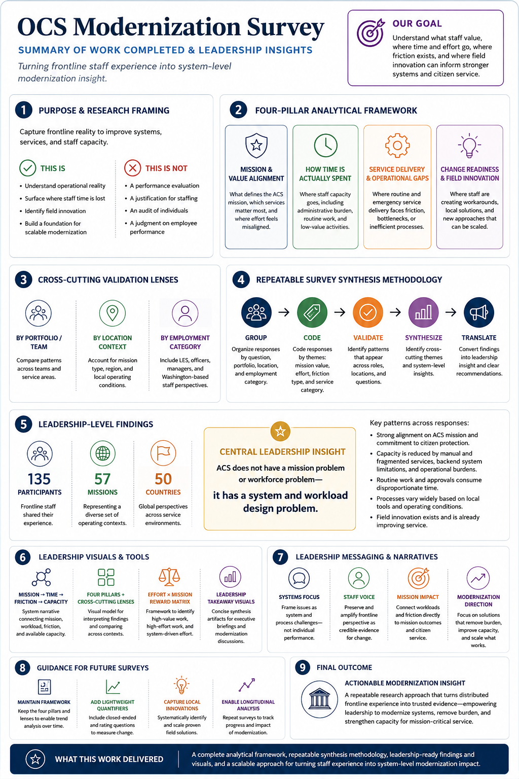
Leadership-ready modernization survey synthesis showing the four-pillar framework, validation lenses, repeatable methodology, key findings from 135 participants across 57 missions in 50 countries, and the resulting system-level insight.
What this work produced
The work resulted in:
a complete analytical framework;
a repeatable synthesis methodology;
leadership-ready findings and visuals;
system-level modernization insights grounded in frontline experience;
and a scalable approach for future ACS modernization research.
Most importantly, it created a structured way to turn distributed frontline experience into credible, actionable organizational insight while keeping the focus on mission, systems, and service capacity.
Why this work matters
Frontline employees often understand system failure long before leadership sees it in a dashboard.
They experience it as duplicated work, manual workarounds, unnecessary approvals, fragmented tools, inconsistent processes, and time pulled away from mission-critical service.
The design challenge is not simply to collect those stories.
It is to turn them into evidence that an organization can understand and act on.
This work connected staff experience → research evidence → system pattern → leadership decision, making frontline knowledge part of the modernization process rather than an anecdote at the edge of it.
Across the Engagement
Together, these workstreams connected two sides of the same service: the experience citizens encounter and the operational systems that make that experience possible.
The work moved between content, research, information architecture, frontline staff experience, analytics, and organizational strategy—but the underlying question remained consistent:
How can a complex government system provide clearer, more trustworthy, and more actionable support when people need it most?
For me, the engagement reinforced a central principle of service design:
People experience the service as one system—even when the organization delivering it is many.